

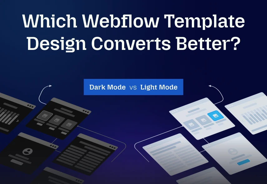
The colours on your website affect whether people click, sign up, or buy. We all see websites in dark mode or light mode everywhere. Some people like the modern feel of dark screens and find them comfortable. Others prefer a bright background and say it reads more easily and looks more professional. Choosing between the two for your Webflow template is a real decision with real consequences.
The question designers keep asking is which one converts better. The honest answer is that it depends on your audience and your content, and this article sets out how to work out which side of that you are on rather than pretending there is a universal winner.
Dark Mode in Webflow
Dark mode templates have become popular, combining a current look with genuine comfort benefits in the right conditions. Many users now expect a dark option:
- Reduced Glare in Low Light: Dark backgrounds cut screen glare in dim environments, which makes long browsing sessions more comfortable.
- Battery Efficiency: On OLED and AMOLED screens, dark pixels draw less power. It is a genuine saving, though a modest one in practice.
- Modern & Premium Feel: A dark interface reads as considered and technical, which suits creative, developer-facing and luxury brands. If your brand leans that way, dark reinforces it.
- Content Hierarchy: A dark background makes bright calls to action and imagery stand out sharply, because there is less competing visual noise around them.
Where Dark Mode Struggles:
- Readability in Bright Conditions: Light text on a dark background can produce halation, where letterforms appear to bleed or blur, particularly for people with astigmatism. If your visitors are often outdoors or in bright offices, this costs you.
- Long-form Reading: Dark mode is generally harder for sustained reading of dense text. If your page is mostly paragraphs rather than imagery, that matters.
- Color & Branding Challenges: Vivid brand colours often look wrong against dark backgrounds and may need desaturating. Expect to rework your palette rather than drop it in unchanged.
- Not Universally Preferred: Plenty of users still prefer light. Committing to dark only will put off some portion of your audience.
If dark is the direction you want, the Webflow dark mode templates roundup covers the builds that do it well, including Somers, Animatory and GYMFreak TNC.
Light Mode in Webflow
Most Webflow templates default to light. It is familiar, easy to scan, and hard to get badly wrong. Here is what it gives you:
- Superior Readability in Daylight: Dark text on a light background is the arrangement most people read fastest, which matters for blogs, documentation and any text-heavy page.
- Familiarity & Trust: Light interfaces feel conventional, which is an advantage in healthcare, legal, financial and public sector contexts where looking unusual is not the goal.
- Content Focus: Light reduces atmosphere and increases clarity, which helps on complex conversion funnels where you want the visitor concentrating on a form rather than the design.
- Easier Accessibility Compliance: Hitting contrast requirements is generally more straightforward with dark text on light, though neither mode is compliant by default.
Where Light Mode Struggles:
- Eye Strain in Low Light: A bright screen in a dark room is uncomfortable, and discomfort makes people leave sooner.
- Battery Consumption: On OLED and AMOLED screens, light backgrounds draw more power than dark ones.
- Harder to Feel Distinctive: Light is the default, so a light design has to work harder on typography and imagery to stand out.
What the Evidence Actually Supports
Be sceptical of anyone quoting a precise conversion uplift for either mode, including us. There is no reliable industry-wide figure, because the effect depends on your audience, your content type and the conditions they browse in. What research on legibility does consistently support is narrower and more useful:
- Dark text on a light background is generally read faster and more accurately for long passages of text.
- Light text on dark can cause halation for some readers, especially those with astigmatism, which is common.
- Dark backgrounds are more comfortable in low ambient light, which is why the preference is strongly context-dependent rather than absolute.
- Contrast ratio matters more than which mode you pick. A poorly contrasted dark theme and a poorly contrasted light theme both fail.
The practical conclusion: give users the choice where you can, and if you cannot, pick based on your content type. Text-heavy site, go light. Image or data-led site viewed in the evening, dark is defensible. Then measure your own numbers rather than trusting anyone’s benchmark.
Dark Mode vs Light Mode Compared
| Feature | Dark Mode Webflow | Light Mode Webflow |
| Comfort in low light | Better | Can cause strain in dark settings |
| Long-form readability | Weaker, halation affects some readers | Stronger, the conventional choice for text |
| Best suited to | Creative, technical, media and luxury brands | Blogs, documentation, healthcare, legal, finance |
| Brand Perception | Modern, technical | Conventional, trustworthy |
| Accessibility | Achievable, but contrast needs care | Easier to get right, still needs checking |
| Battery Efficiency | Better on OLED screens | Standard |
Webflow Template Design: Best Practices For Conversion
Dark or light, implementation decides the outcome. Here is what actually moves the numbers:
1. Offer a Mode Toggle: Let users pick, and remember their choice across sessions. Respecting the operating system preference by default is better still, since most people have already made that decision once.
2. Accessibility: Meet a contrast ratio of at least 4.5:1 for body text and 3:1 for large text, per WCAG AA. Check both modes separately, because passing in one says nothing about the other.
3. Avoid Pure Black and Pure White: Very dark grey against off-white is easier on the eye than #000 against #FFF, which produces the harshest possible contrast and worsens halation.
4. Optimize for Speed: Compressed assets, clean markup and responsive layouts matter more to conversion than the colour scheme does. See common Webflow mistakes for the usual culprits.
5. Strategic Placement of Conversion Elements: Put calls to action, forms and key content where users expect them rather than where the design looks most balanced.
6. Test & Measure: Split test and use analytics to compare the two on your own traffic. Your data beats any general claim, including everything above.
7. Strong Content & Visuals: Clear headlines, concise copy and good imagery. No colour scheme rescues weak content.
Want to see both approaches side by side? Browse the TNCFlow template catalogue, where several builds ship dark and light homepage variants in the same file, including Hugecon.
Why Are Different Template Designs Important?
Everyone has a preference. Some find dark easy on the eyes at night and think it looks sharp. Others say light is clearer and more professional in a bright room. As builders we cannot simply pick our own favourite. The audience decides, and how the choice affects their reading and their behaviour is what actually matters.
TNCFlow templates cover both, across agency, ecommerce, CMS, SaaS, automotive, community and marketing use cases, so you can launch in days rather than months. Browse the catalogue to see what fits.
Frequently Asked Questions
Does dark mode or light mode convert better?
Neither wins universally, and anyone quoting a specific uplift figure is guessing. It depends on your content type and where your audience browses. Text-heavy sites generally do better light; image and data-led sites viewed in the evening can do well dark.
Is dark mode better for accessibility?
Not automatically. It helps people with light sensitivity and hinders people with astigmatism, who may see light text bleed. Offering both is the accessible answer, not picking one.
Does dark mode affect SEO?
No. Search engines do not favour either colour scheme. What does affect rankings is page speed, mobile usability and content quality, none of which depend on your background colour.
Should I offer both modes with a toggle?
Where you can, yes. Better still, default to the visitor’s operating system preference and let the toggle override it. It costs you some build time and removes the guess entirely.
What contrast ratio do I need?
WCAG AA asks for 4.5:1 on body text and 3:1 on large text. Check each mode separately, since a palette that passes in light frequently fails when inverted.
Does dark mode really save battery?
On OLED and AMOLED screens, yes, because dark pixels draw less power. On traditional LCD screens the difference is negligible, since the backlight runs regardless.
Where can I find dark mode Webflow templates?
Our dark mode templates roundup covers the current selection, and the full catalogue includes builds shipping both variants in one file.
Conclusion
The choice depends on your users and their context. Dark offers atmosphere and comfort in low light. Light offers readability and familiarity. Both convert well when implemented with proper contrast and a clear hierarchy, and both fail when they are not.
The strongest approach is to let visitors choose and to default to their system preference. Then focus on the things that reliably matter: clear calls to action, adequate contrast, and fast load times. Ready to pick a starting point? Browse the full template catalogue.